
How to Attract More Attention With The Front of Package
When your product is sitting on a shelf in stores, it’s one option among many. All these products are fighting for shoppers' attention and a chance to make that sale. So what’s a brand to do?
The first step in encouraging shoppers to consider buying is getting them to notice your product. Your packaging is the best tool you have to catch the eyes of shoppers', so use the front of the package wisely!
Let’s talk about three design elements and strategies you can use to draw attention to your product.
Bold Graphics
The front of a package functions just like a billboard. It has to communicate a lot of information in a very short amount of time. And just like a billboard, people need to be able to read and understand it from far away while they are on the move.
Singular, large visual elements draw our eye and demand attention. Don’t create a collage of many small graphics, images, and text snippets all over the front of your packaging. Instead choose one significant visual to take center stage and become the main focus.
You want shoppers to be able to see, read, and understand your front of the package from 5 feet away or more. Create a high level of contrast between the main image and the background to ensure your graphics stand out.

Pops of Color
Color is the first design element our eyes notice with bright and rich colors drawing the most attention. This is why so many brands use bold colors in their package designs. Now you don’t have to go as bold with color as the fan favorite Poppi. In fact, I would say don’t copy their color strategy just because it’s working for them. Instead, choose colors that represent your brand and messaging strategy to evoke specific feelings in your customers.

Poppi’s bold, high-contrast colors work because they are unexpected in the healthy soda category, just like their use of apple cider vinegar was unexpected when they launched. Now everyone’s following suit, so Poppi is going to have to go out of their way to continue being the leader in their category.
To use color to attract attention to your packaging, pick colors that align with your brand strategy, compliment your product, and create an emotional connection with your customers. Your color choices will work even harder for you if your colors are distinctly different from the competing products on the shelf.

Open a Window
We can’t help but reach out and touch that soft looking sweater, or smell that fragrant candle. It’s in our nature to use all of our five senses when deciding what to bring into our homes. How can you engage shoppers’ senses, when your product needs the protection of a box or a pouch? Why add a clear or die cut window of course!
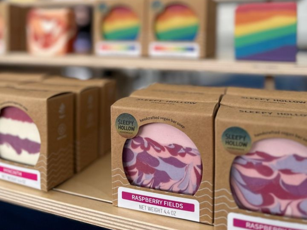
Die cut windows are open to invite shoppers to see, feel, or smell the product. When adding a window to the front of any package consider what will show through and how the shape will integrate into the graphics. Choose a window shape that frames the product and connects with the brand. For Sleepy Hollow Handmade, we framed the soap as like a work of art in a circular window that compliments the logo.
Want to show off your product but need a little more protection? Clear windows are the perfect option. A see-through window allows shoppers to see the actual product without having to open the package. Giving customers that sneak peek, shows that your brand is transparent and honest, values that instill trust.
You Aren’t Using Your Packaging to Show Customers “Why to Buy.”
What does your customer truly want when they buy a product like yours? Is it ease and convenience, health and wellness, or style and status? Think beyond the features built into your product and get the core problem your product solves for shoppers. This solution your product provides is your “why to buy,” and every product should have one.
Your packaging should not only show what your product does but also why customers should buy it. This doesn’t have to be complicated, in fact, it should be super simple (remember we’re looking for skimmable content). Take a baking mix for example: the main value is being able to easily make a delicious cake without buying a ton of ingredients. Most mixes quickly show off this benefit with a photo or illustration of a perfect-looking slice of cake. So, consider how you can highlight the unique “why to buy” for your product as simply as the slice of cake on a baking mix box.
Conclusion
Have you gotten a little dose of inspiration for revamping the front of your packaging? Amazing!
I love helping product business owners level up their shelf presence.
It can be overwhelming because there’s not a lot of practical guidance out there.
I’ve been designing packaging for years, and nothing makes me happier than sharing my tips and strategies with you so your products can stand out and sell more.
Do you have any questions about using your front-of-package to attract more ideal customers? Send them to my Instagram DMs. I’m always happy to chat!
While we're on the topic of using your packaging to attract attention on shelf, have you seen my blog post on How to Get Your Product into More Stores? It's perfect for entrepreneurs like you who want to grow their wholesale orders in the next 3 months.
